Service design · Vodafone · Fjord London · 2018
Transforming the call centre, so agents can act in a few seconds.
- Role
- Service Design Lead and Senior Manager at Fjord (Accenture Song), London HQ, 2015–2019. Led international teams of around 14.
- Users
- Vodafone's call-centre agents, and the customers who call them.
- Scope
- Research, UX/UI, and new training and management guidelines.
- Status
- Delivered.
How might we transform Vodafone's customer and employee experience?
The problem
Complaints were at a record high, and agents couldn't fix what customers called about.
Customers called about bills, contracts and technical problems that often stayed unsolved. Agents jumped between several CRM systems, took a long time to learn them and kept having to relearn. Even when they understood the problem, they often didn't have the authority to fix it. Sales and the perception of customer service were both falling.
After the redesign
Agents could act in a few seconds, from one screen.
- Much shorter training
- Less stress for agents
- Customers repeated themselves less
- Issues solved faster

Fjord London
I led multidisciplinary teams of around 14 people, from many countries, for Meta, Vodafone, the NHS and Kingfisher.
Most of that work is confidential. Vodafone is one of the projects I can show.
Seven moments in every call.
We mapped the agent's work into one framework, and designed the tool around it.
- Single sign-onOne login for every system
- DashboardTools, team and live status
- Customer profileThe whole customer, on one screen
- Information spotlightGuides the agent to the cause
- RecommendationsThe next best action
- ConfirmationBoth sides see it's done
- Capturing and learningNotes and reports write themselves
- Back to the customer profile for the next issue
What the agent sees.
The screens we designed: the security check, the agent's dashboard and the customer profile, with placeholder data.
Scroll sideways to see the whole image →
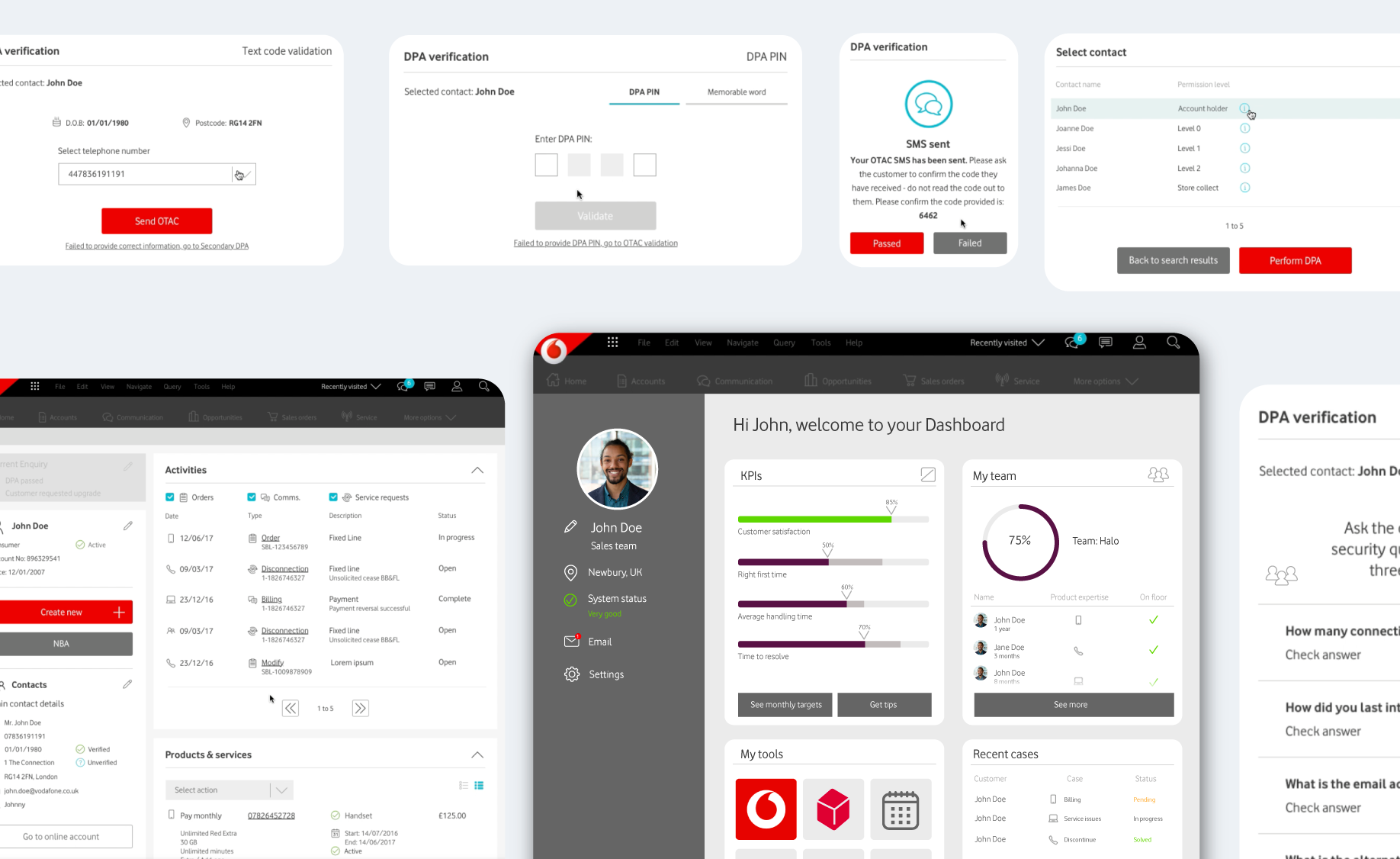
Roaming charges from three days abroad. Sam called about the same bill 9 days ago.
- 9 daysCall · bill query, open
- 2 moOrder · new handset
- 8 moChat · roaming question
The design rule
Scan it, then act in seconds.
We moved away from complex tables. The reason for the call, the history and the products became visual blocks an agent can take in at a glance, with the next step right next to them. The customer isn't asked the same thing twice.
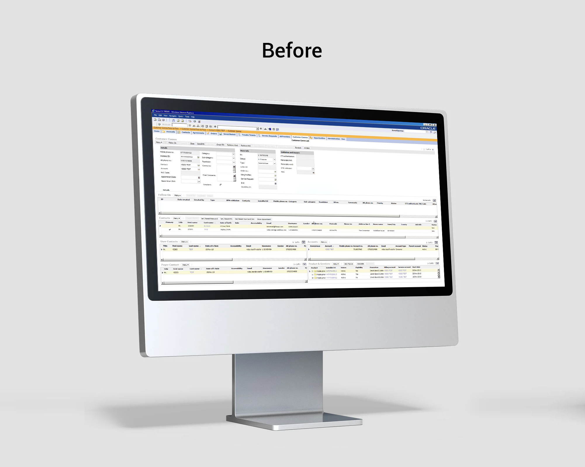
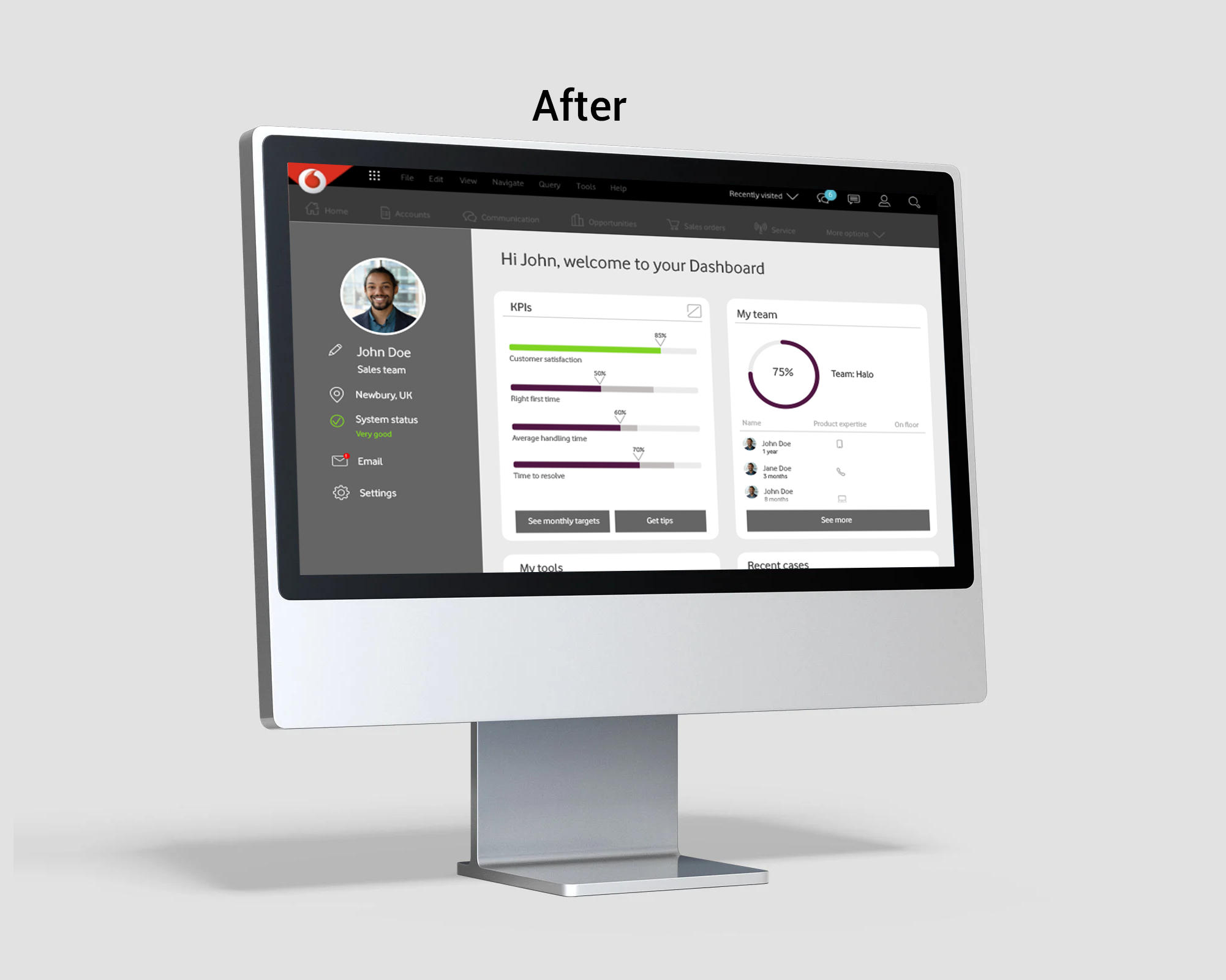
Every call started here.
The old customer screen in Siebel, and the new agent dashboard that replaced it.
The rules behind it.
The screen was half the job. The other half was how agents learn and work.
01
Everything to act, in one place.
One platform with all the customer's information, so nobody is asked the same question twice.
02
Scan, don't read.
Visual blocks instead of tables. The agent should see what matters before the customer finishes the sentence.
03
The tool suggests the next step.
Recommendations based on this call and past ones, with a clear confirmation for agent and customer.
04
Fix the offline part too.
New training and management guidelines, so agents learn faster and solve more problems themselves.

What changed for agents
Shorter training, less stress.
The new UX/UI cut the learning curve, so training time got much shorter. Agents were less stressed, because they could find information and act in a few seconds, all in one place. Customers repeated themselves less and got their issues solved faster.
The project film: the old Siebel screens, then the new ones